Elizabeth Hanke
08/31/2026
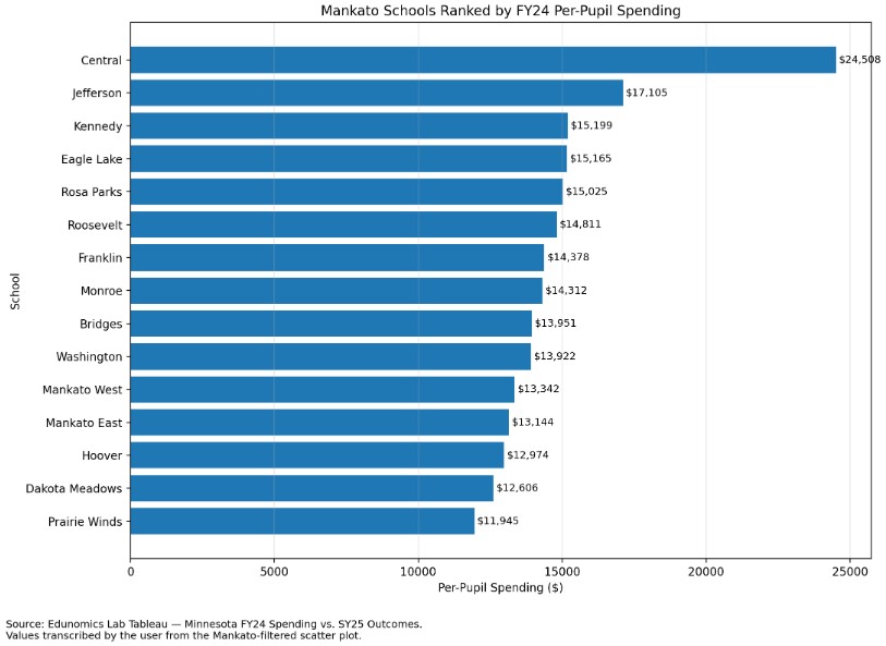
Using Edunomics as a source I created a bar graph of spending per school for year 24.
When we talk about the school district budget, we usually talk about one large districtwide number.
But that does not answer a more basic question:
How much are we spending per student at each individual school, and what academic results are we seeing?
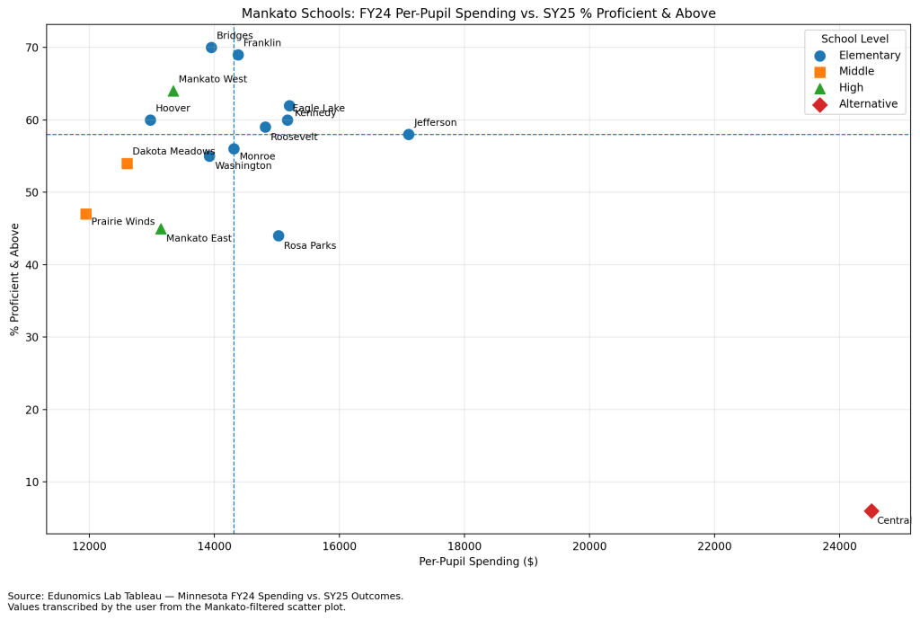
Edunomics Lab at Georgetown University has created a Minnesota scatterplot that compares FY2024 per-pupil spending with SY2024–25 academic outcomes. The visualization allows users to filter by district and see school-level spending alongside the percentage of students who are proficient or above.
For Mankato Area Public Schools, the differences are substantial.
Among the schools in the Edunomics data, per-pupil spending ranges from $11,945 at Prairie Winds to $24,508 at Central.
Central is clearly an outlier because it serves a very small and specialized student population, so it should not be compared directly with a traditional elementary, middle, or high school.
Even setting Central aside, however, there is still a large range.
Prairie Winds: $11,945 per student
Dakota Meadows: $12,606
Hoover: $12,974
Mankato East: $13,144
Mankato West: $13,342
Washington: $13,922
Bridges: $13,951
Monroe: $14,312
Franklin: $14,378
Roosevelt: $14,811
Rosa Parks: $15,025
Eagle Lake: $15,165
Kennedy: $15,199
Jefferson: $17,105
Central: $24,508
That means that among the more traditional schools, there is more than a $5,000-per-student difference between Prairie Winds and Jefferson.
For a school serving several hundred students, that difference can represent millions of dollars.
There is another important limitation to this data.
School-level expenditure reports assign costs to particular schools, but that does not necessarily mean every employee whose salary is charged to one site spends all of their working time there.
For example, some administrators or other staff may:
- support more than one school,
- work districtwide responsibilities,
- help with summer school,
- supervise programs outside their primary building,
- or split their time among several sites.
If their salary is primarily recorded under one school, the full cost may appear there even though part of their work benefits students elsewhere.
What the Data Shows and What It Doesn’t
The Edunomics chart compares per-pupil spending with the percentage of students who are proficient or above. Some schools stand out: Bridges spends about $13,951 per student with 70% proficient, Franklin spends $14,378 with 69% proficient, and Mankato West spends $13,342 with 64% proficient. By comparison, Rosa Parks spends $15,025 with 44% proficient, while Jefferson spends $17,105 with 58% proficient.
Those numbers should not be treated as a simple ranking. Student needs vary. Franklin, for example, serves 62% economically disadvantaged students, while Rosa Parks serves 60% economically disadvantaged students and 25% special education students. Staffing, school size, specialized programming, transportation, and shared services can all affect costs.
There is also an accounting limitation: some administrators and other staff may support multiple schools, summer school, or districtwide programs even if their wages are assigned primarily to one site. Likewise, a school may benefit from services whose costs are recorded elsewhere.
So the important questions are not simply which school spends the most or least. We should be asking Instead of asking only whether one school spends more than another, I think we should ask:
- How have these numbers changed over the last three to five years?
- How much of the difference is explained by staffing, special education, enrollment size, transportation, programming, or building-level costs?
- Why are some schools achieving stronger academic outcomes with similar or lower spending?
- Are there practices at higher-performing schools that can be replicated?
- Where are additional dollars producing measurable improvements?
- Where are we spending more without seeing the academic gains we hoped for?
That is the value of this data. It gives us a starting point for asking better questions about how resources are being used and what students are getting in return.
For readers who want to explore the original visualization, Edunomics Lab’s Minnesota scatterplot is available here: Minnesota Spending vs. Outcomes Scatterplots. After opening it, unselect “All” and select Mankato Area Public Schools.


Leave a Reply